Paul Tol's Notes
Colour schemes and templates
INTRODUCTION TO COLOUR SCHEMES
31 July 2026Graphics with scientific data become clearer when the colours are chosen carefully. It is convenient to have good default schemes ready for each type of data, with colours that are:
- distinct for all people, including colour-blind readers;
- distinct from black and white;
- distinct on screen and paper;
- matching well together.
- Qualitative data – nominal or categorical data, where magnitude differences are not relevant. This includes lines in plots and text in presentations.
- Diverging data – data ordered between two extremes where the midpoint is important, e.g. positive and negative deviations from zero or a mean.
- Sequential data – data ordered from low to high.
- Info on simulating approximately how any colour is seen if you are colour-blind.
- The schemes that work well in a monochrome display or printout are highlighted, with tips on how to use them best.
- A very specific colour scheme for the AVHRR global land cover classification.
- A look at a traditional, bad rainbow scheme and how a scheme with fewer colours can be better.
- Map projections for world maps that work well.
- A way of splitting the data analysis and the production of maps.
- A general LaTeX template for reports.
MY WEBSITE WAS MOVED
7 July 2026On 31 March 2025, my site www.sron.nl/~pault was moved to https://sronpersonalpages.nl/~pault.
QUALITATIVE COLOUR SCHEMES
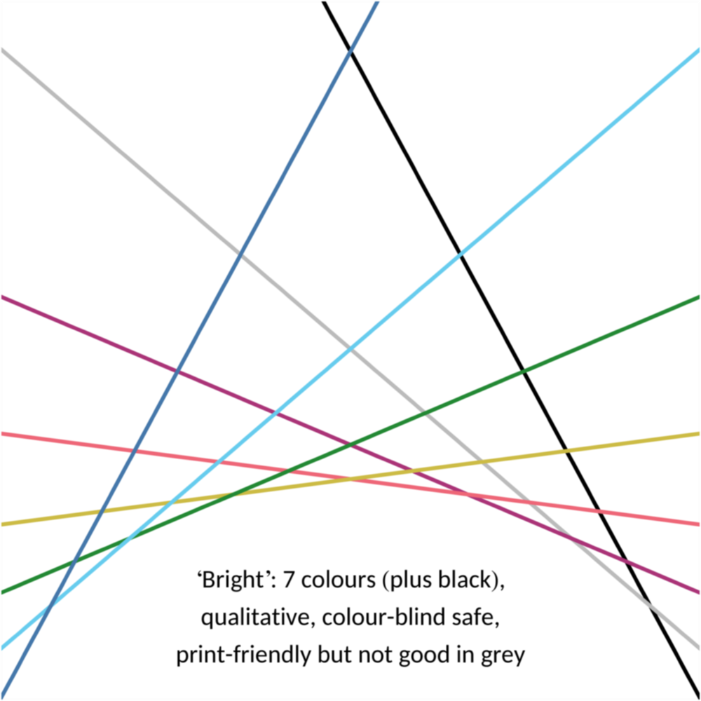
16 August 2026My default colour scheme for qualitative data is the bright scheme in Fig. 1. Colour coordinates (R,G,B) are given in the RGB colour system (red R, green G and blue B), decimal at the top and hexadecimal below. Click on this and other defining figures for the hexadecimal values as text. An alternative when fewer colours are enough is the high-contrast scheme in Fig. 2, which also works when converted to greyscale. A second alternative is the vibrant scheme in Fig. 3, designed for data visualization framework TensorBoard. A third alternative is the muted scheme in Fig. 4, which has more colours, but lacks a clear red or medium blue. A fourth alternative is the medium-contrast scheme in Fig. 5 with three colour pairs that can work in greyscale, but not as well as the high-contrast scheme.
If there is a requirement that the contrast ratio of the colours with white (but not necessarily with black or each other) is at least 4.5, the blue, green and purple from the bright scheme can be used, or any of the eleven colours from the fifth alternative, dark scheme in Fig. 6. This is useful to read text or see lines if vision is moderately low, but the colours in the dark scheme are less distinct from each other.
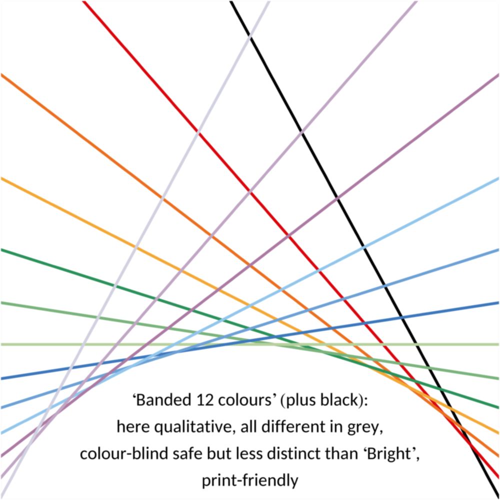
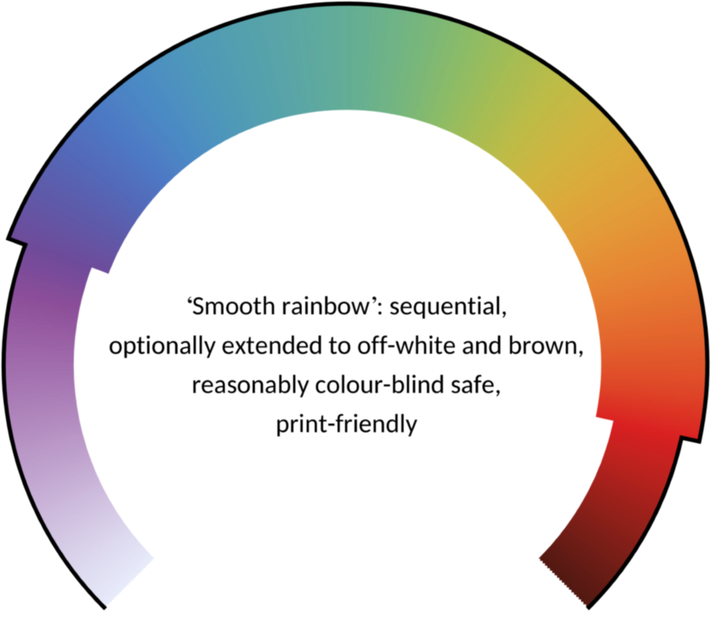
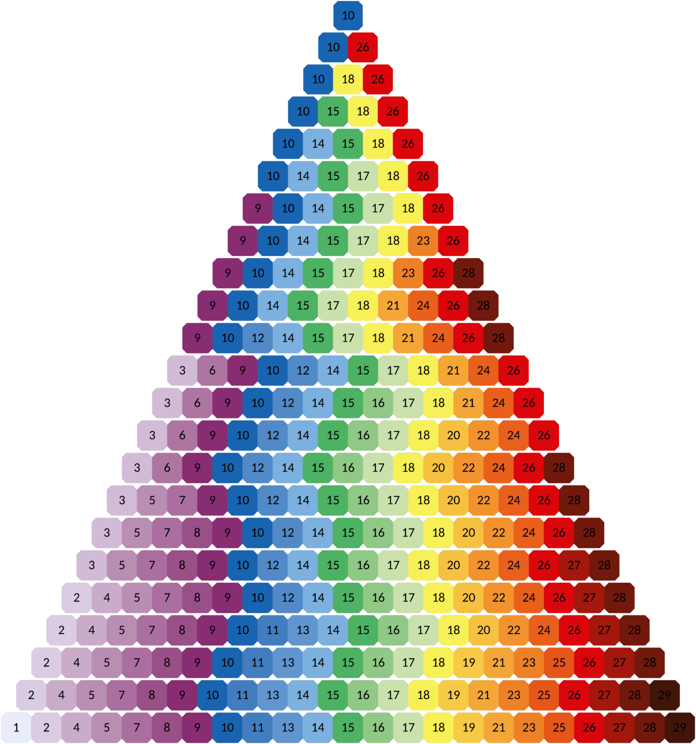
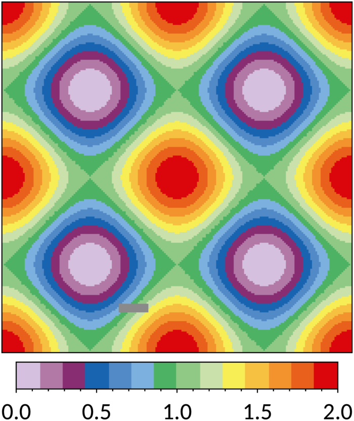
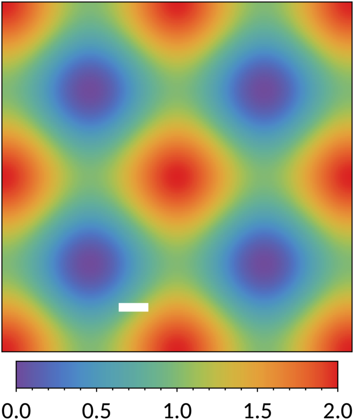
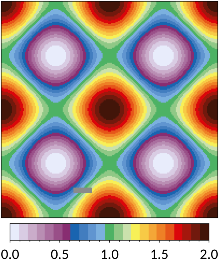
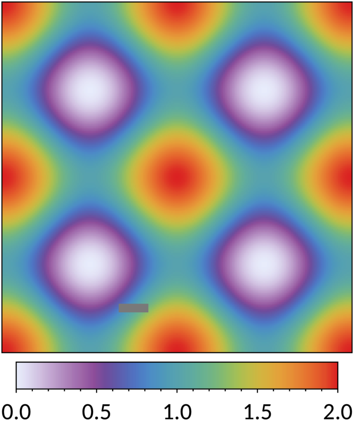
For more than nine distinct colours, a sequential colour scheme can be (mis)used: one of three banded colour schemes (Fig. 24), the discrete rainbow colour scheme (Fig. 25) skipping the lightest colours for lines on a white background, or the smooth rainbow colour scheme (Fig. 23) starting at purple, interpolated in large equal steps.

Colours in default order: '#4477AA', '#EE6677', '#228833', '#CCBB44', '#66CCEE', '#AA3377', '#BBBBBB'.
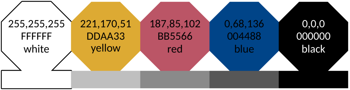
Colours in default order: '#004488', '#DDAA33', '#BB5566'.

Colours in default order: '#EE7733', '#0077BB', '#33BBEE', '#EE3377', '#CC3311', '#009988', '#BBBBBB'.

Colours in default order: '#CC6677', '#332288', '#DDCC77', '#117733', '#88CCEE', '#882255', '#44AA99', '#999933', '#AA4499'. Bad data: '#DDDDDD'.


Colours in default order: '#6699CC', '#004488', '#EECC66', '#994455', '#997700', '#EE99AA'.

Colours in default order: '#4477BB', '#CC4466', '#228833', '#2255AA', '#993366', '#006644', '#117788', '#882288', '#BB4488', '#775500', '#444444'.
The bright, high-contrast, vibrant, muted, medium-contrast and dark schemes work well for plot lines and map regions, but the colours are too strong to use for backgrounds to mark (black) text, typically in a table. For that purpose, the pale scheme is designed (Fig. 7). The colours are inherently not very distinct from each other (pick pale purple last), but they are clear in a white area. This pale scheme can also be used in combination with the bright scheme, for example showing the full data range as a pale area and the mean as a bright line, or a pale fit line with the bright measured points on top.
Colours: '#AACCEE', '#CCEEFF', '#BBDDBB', '#EEEEBB', '#FFBBCC', '#EEBBDD', '#DDDDDD'.
There are situations where a scheme is needed between the bright and pale schemes, for example (Fig. 11) for backgrounds in a table where more colours are needed than available in the pale scheme and where the coloured areas are small. For this purpose, the light scheme of Fig. 8 is designed.
Colours in default order: '#77AADD', '#EE8866', '#EEDD88', '#FFAABB', '#99DDFF', '#44BB99', '#BBCC33', '#AAAA00', '#DDDDDD'.
Colour names have been added to the scheme definitions as mnemonics for the maker of a figure, not necessarily for use in text: a reader should not have to guess what olive looks like. Colours are identified uniquely by their names within the collective of the bright, pale and light schemes, whereas the high-contrast, vibrant, muted, medium-contrast and dark schemes reuse some names for different colours.
The colours within a qualitative scheme are given in order of changing hue (or luminance in the case of the high- and medium-contrast schemes), but the colours can be picked at random. Often, a data type suggests an appropriate choice or similar data types can be grouped by giving them similar colours. If the colours have to be picked in a fixed sequence, a good order for each scheme is as follows. Click on the defining figures above for the hexadecimal values in this order as text.
- bright:
- blue red green yellow cyan purple grey
- high-contrast:
- blue yellow red
- vibrant:
- orange blue cyan magenta red teal grey
- muted:
- rose indigo sand green cyan wine teal olive purple
- medium-contrast:
- light blue dark blue light yellow dark red dark yellow light red
- dark:
- blue red green sapphire maroon pine teal purple magenta brown grey
- light:
- light blue orange light yellow pink light cyan mint pear olive pale grey
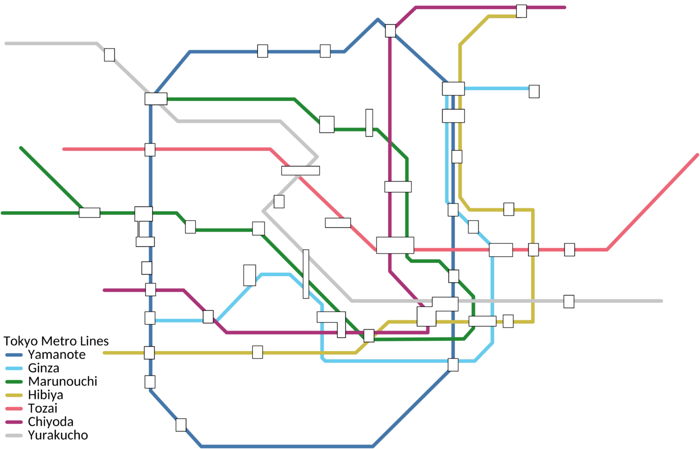
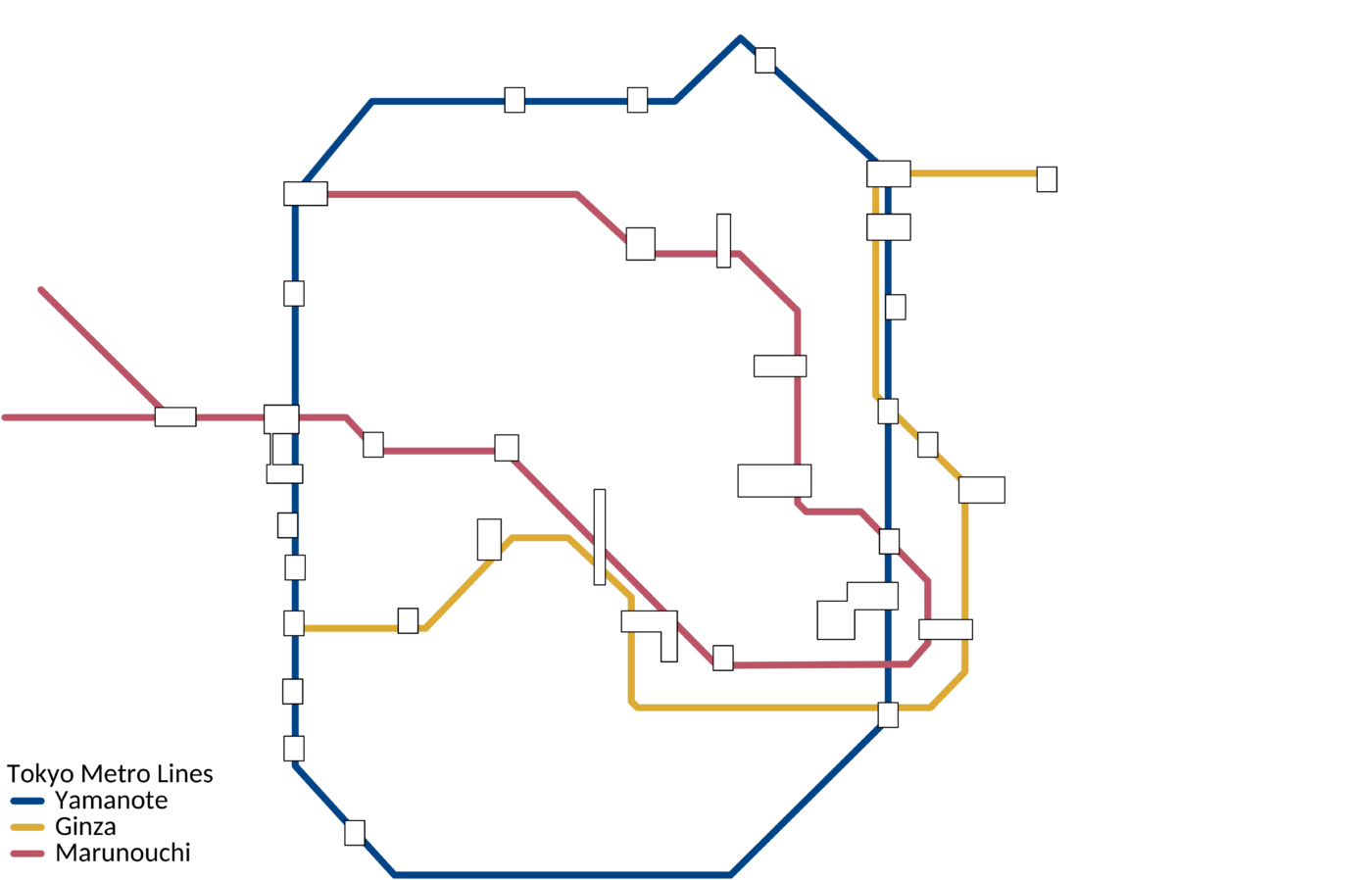
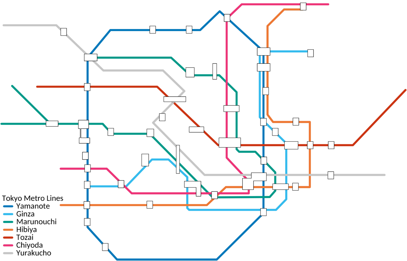
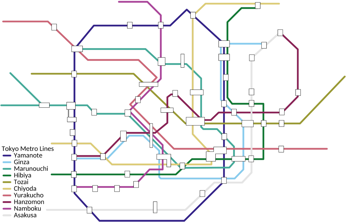
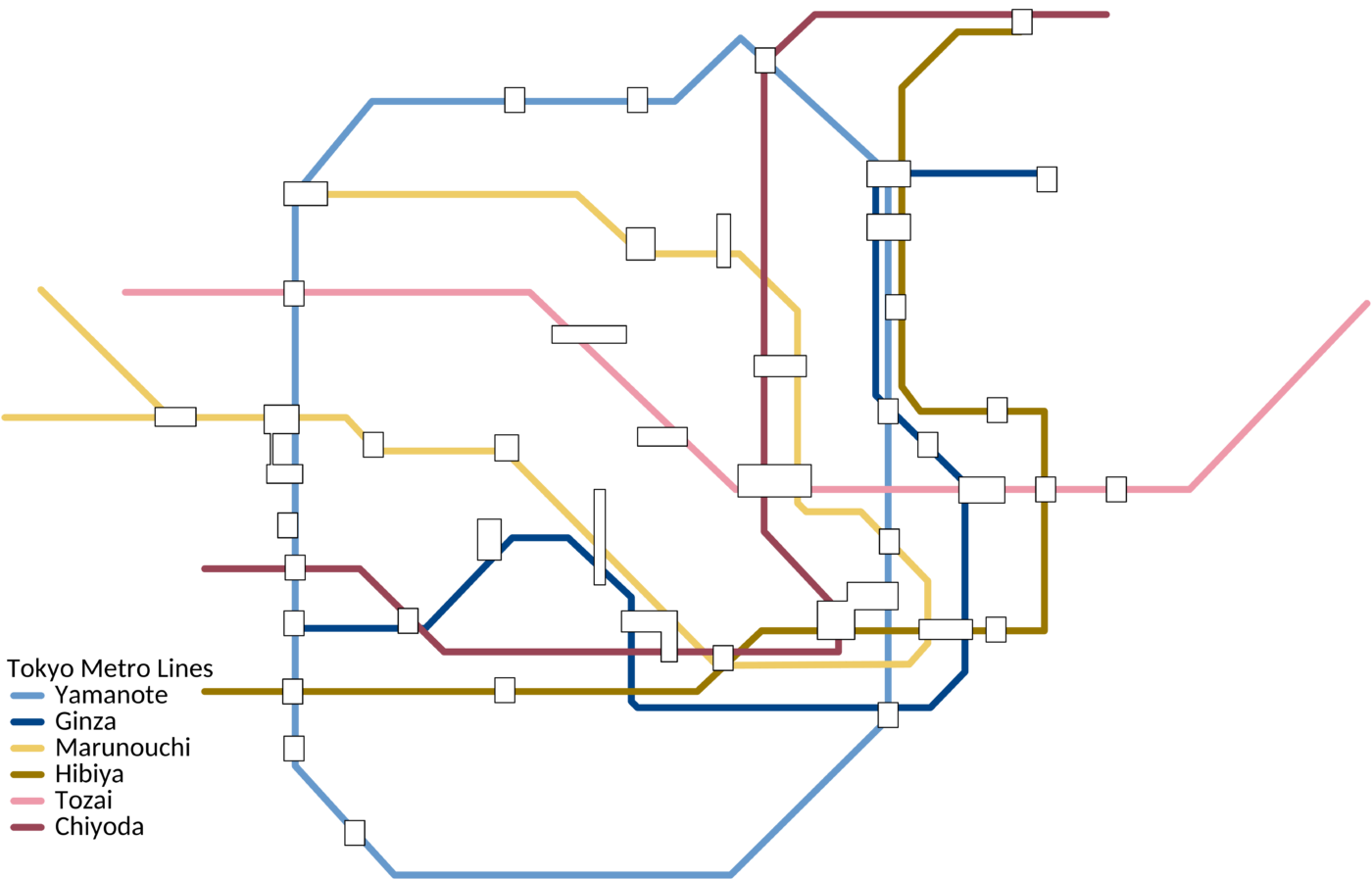
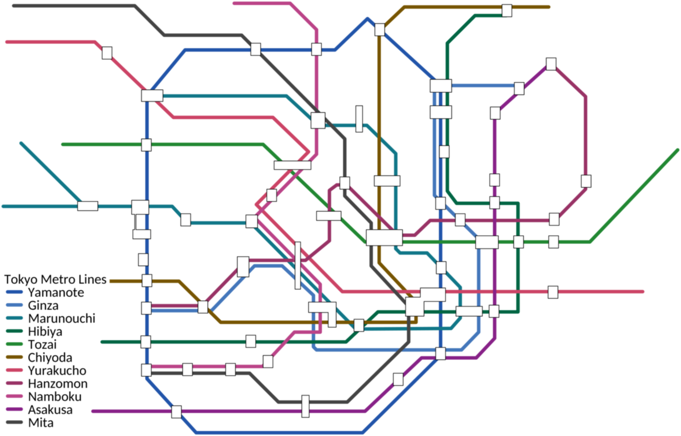
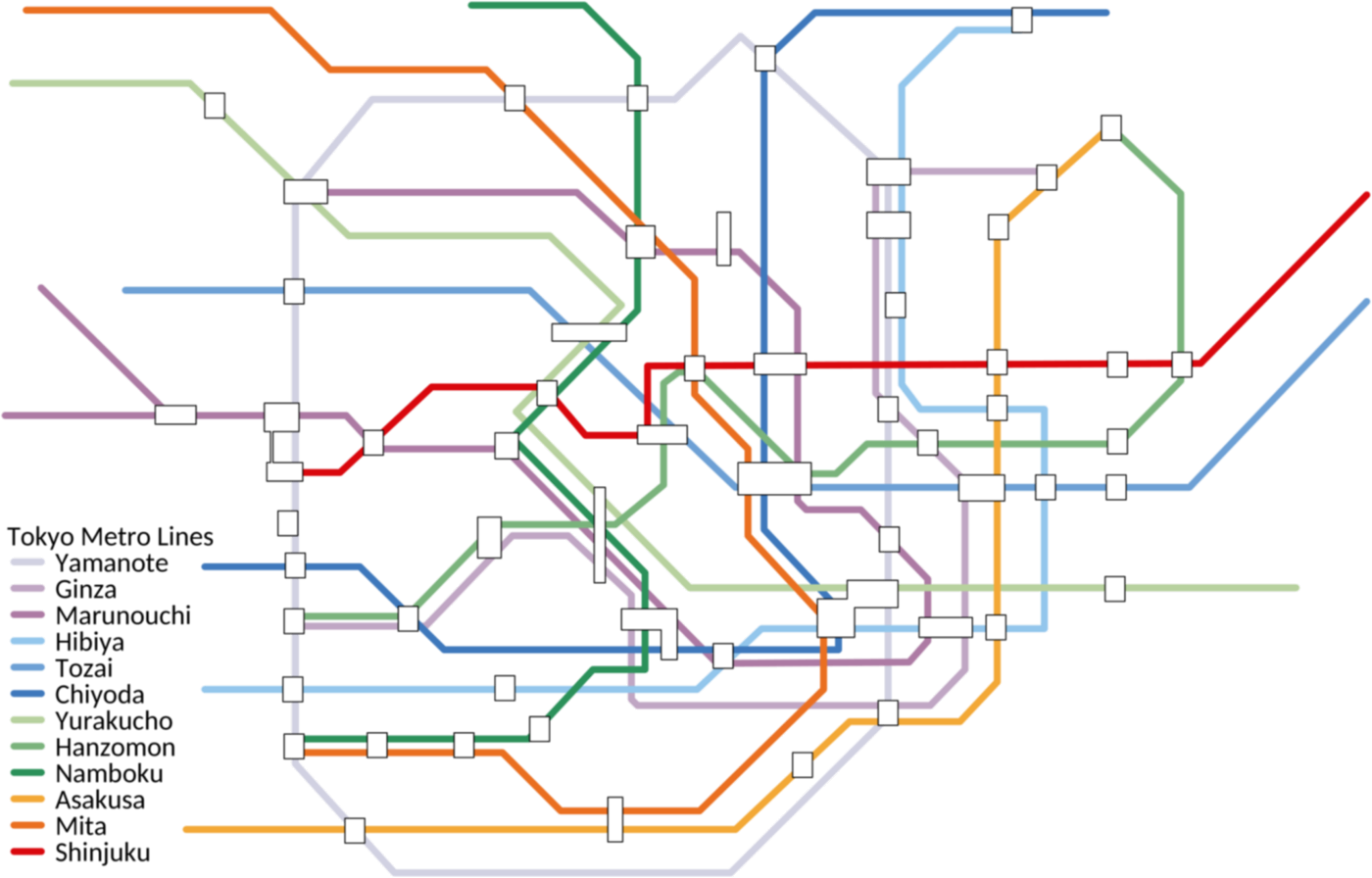
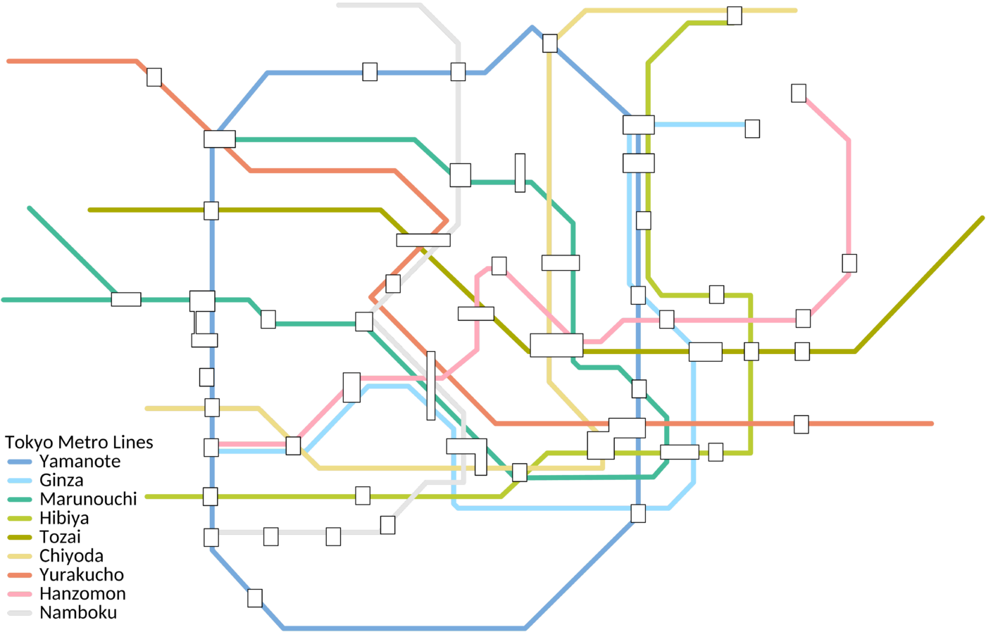
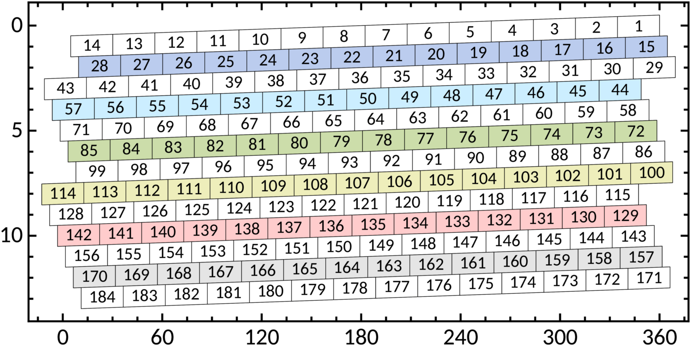
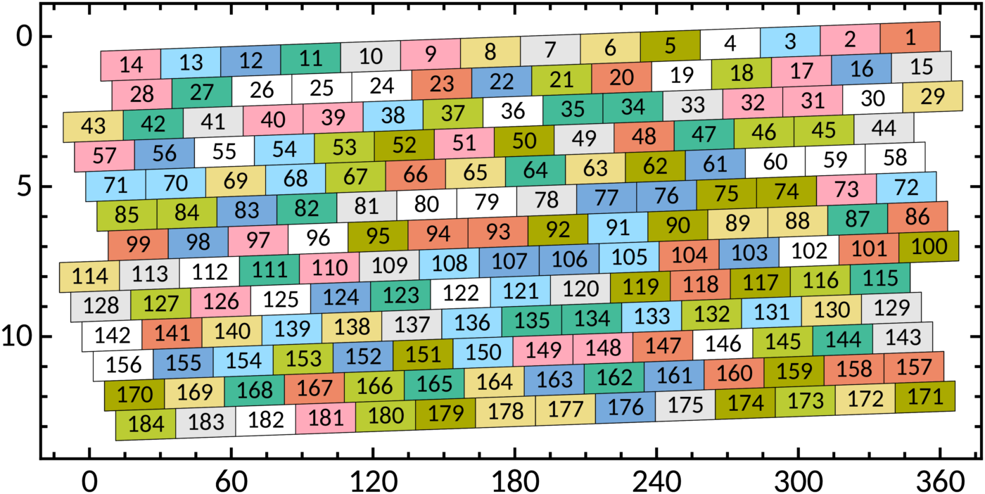
Examples of the use of the qualitative schemes are given in Figs. 9 and 10 for lines of the Tokyo metro and in Fig. 11 for cell backgrounds and text blocks.







The design of the qualitative schemes involved four types of calculations:
- for the distance between colours the CIEDE2000 colour difference ΔE00 is used;
- red-blind and green-blind vision is simulated by the method described later;
- colours with the same product S × B of saturation S and brightness B in the HSB colour system (same vividness) match well together;
- colours are called print-friendly if they are within the CMYK gamut provided by colour profile ISO Coated v2 300 % (discussed below).
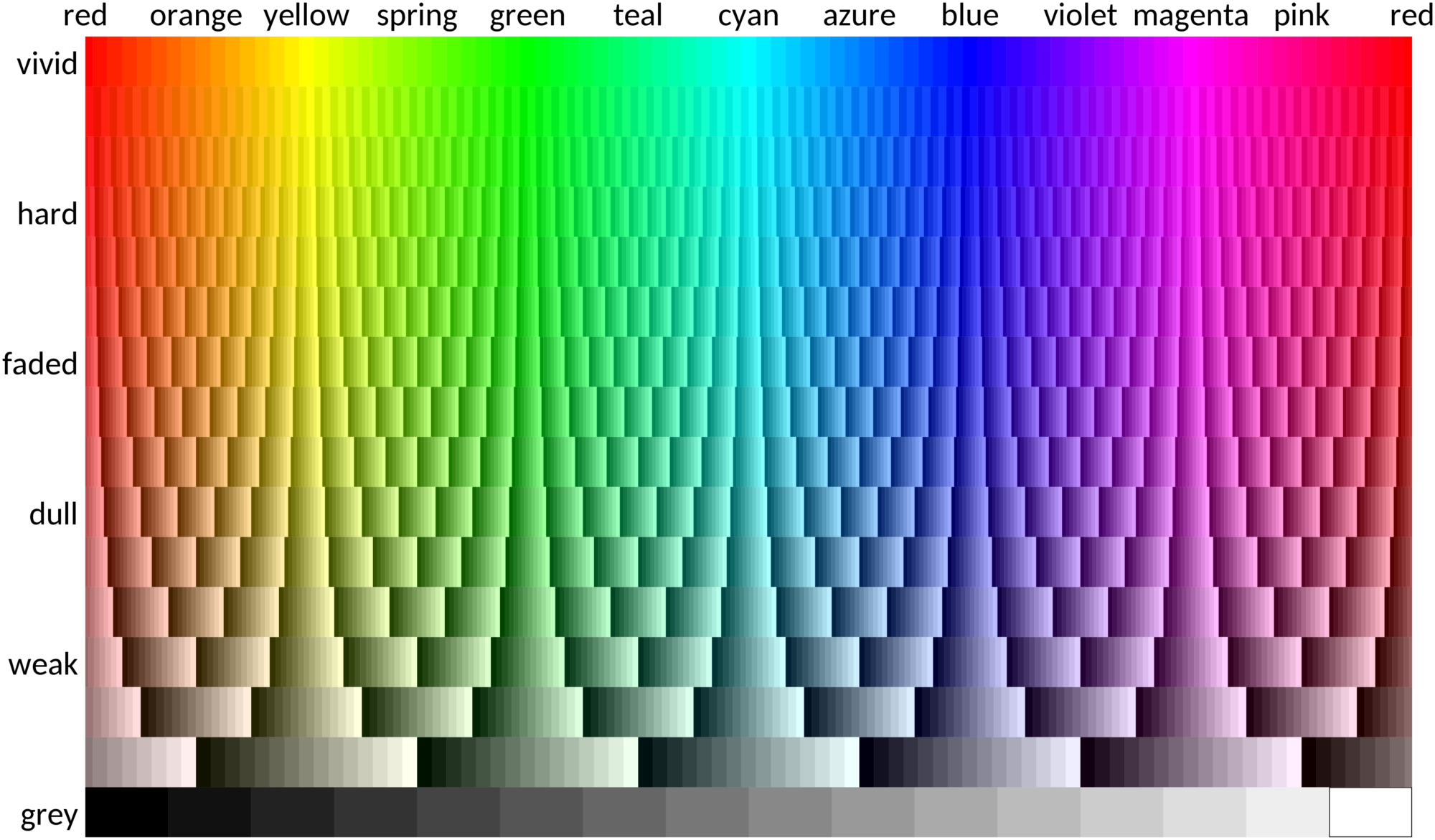
All colours on this site are defined in sRGB colour space, the default used by most software and displays. Printers work in a different colour space that also varies from model to model. When they conform to international standard ISO 12647-2 and the exact printing conditions are not known beforehand, it is recommended to assume the CMYK colour space provided by colour profile ISO Coated v2 300 %. All scheme colours are taken from the overlap between this and the sRGB colour spaces, shown in the diagram below (click on it for the detailed version). Individual printers may deviate, probably not so much that colours become unrecognizable, but enough to push some colours closer together. However, it is not possible to take individual printers into account.
The Netherlands Standardization Institute NEN has issued a code of practice which includes a recommended scheme with eight colours, three greys and white. The colours are bright, but differences between them in colour-blind vision are often much smaller than the smallest difference in the bright, vibrant or muted schemes, two colours are not print-friendly and they cannot be quoted without infringing copyright.
DIVERGING COLOUR SCHEMES
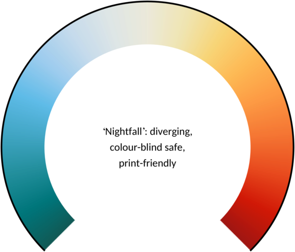
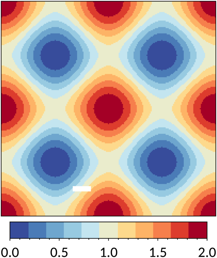
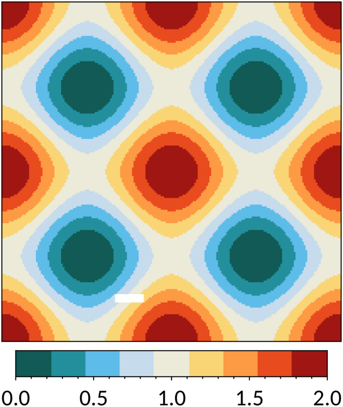
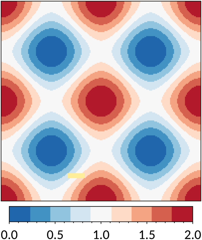
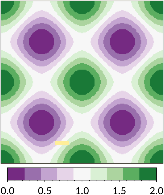
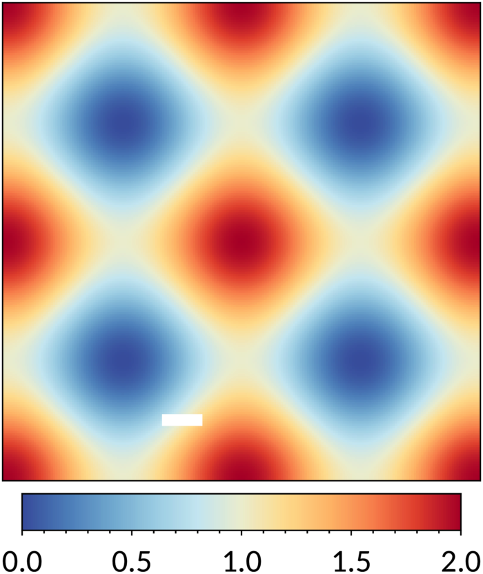
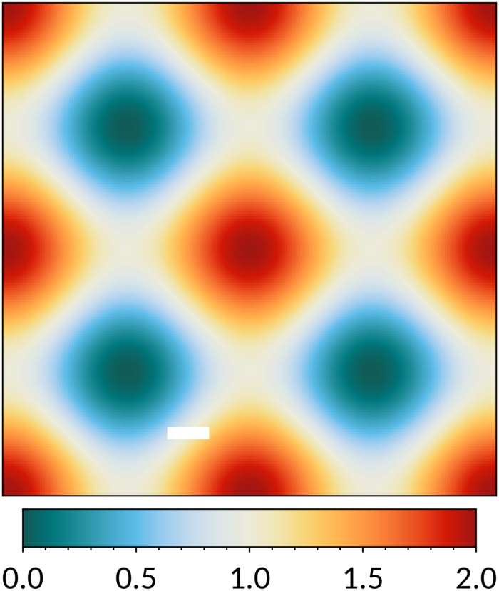
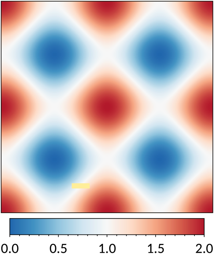
9 October 2022Diverging schemes are for ordered data between two extremes where the midpoint is important. Such schemes could be constructed simply by scaling the colour coordinates linearly, e.g. from blue to white to red. However, by including subtle hue changes, the colours are more distinct and the schemes more attractive. Figures 13, 14, 15 and 16 show the sunset, nightfall, BuRd and PRGn schemes, which are tweaked versions of schemes on the ColorBrewer website. The darkest shades of the original versions have been removed, because they are too dark and similar to be used in practice. The circled colour is meant for bad data, without drawing attention away from good data with a large deviation from zero. The sunset and nightfall schemes were designed for situations where bad data have to be shown white, with more hues in the nightfall scheme. The four schemes look similar in colour-blind vision, so if more than one is used, do not reverse the direction in one of them. If more colours than shown are needed from a given scheme, use a continuous version of the scheme instead of the discrete colours, by linearly interpolating the colour coordinates. If fewer colours are needed, pick colours at equidistant points in the continuous version.
Colours: '#364B9A', '#4A7BB7', '#6EA6CD', '#98CAE1', '#C2E4EF', '#EAECCC', '#FEDA8B', '#FDB366', '#F67E4B', '#DD3D2D', '#A50026'. Bad data: '#FFFFFF'. Colours: '#125A56', '#00767B', '#238F9D', '#42A7C6', '#60BCE9', '#9DCCEF', '#C6DBED', '#DEE6E7', '#ECEADA', '#F0E6B2', '#F9D576', '#FFB954', '#FD9A44', '#F57634', '#E94C1F', '#D11807', '#A01813'. Bad data: '#FFFFFF'. Colours: '#2166AC', '#4393C3', '#92C5DE', '#D1E5F0', '#F7F7F7', '#FDDBC7', '#F4A582', '#D6604D', '#B2182B'. Bad data: '#FFEE99'. Colours: '#762A83', '#9970AB', '#C2A5CF', '#E7D4E8', '#F7F7F7', '#D9F0D3', '#ACD39E', '#5AAE61', '#1B7837'. Bad data: '#FFEE99'.



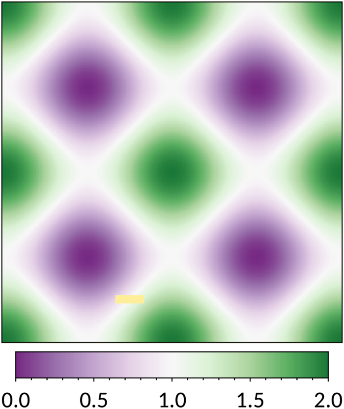




SEQUENTIAL COLOUR SCHEMES
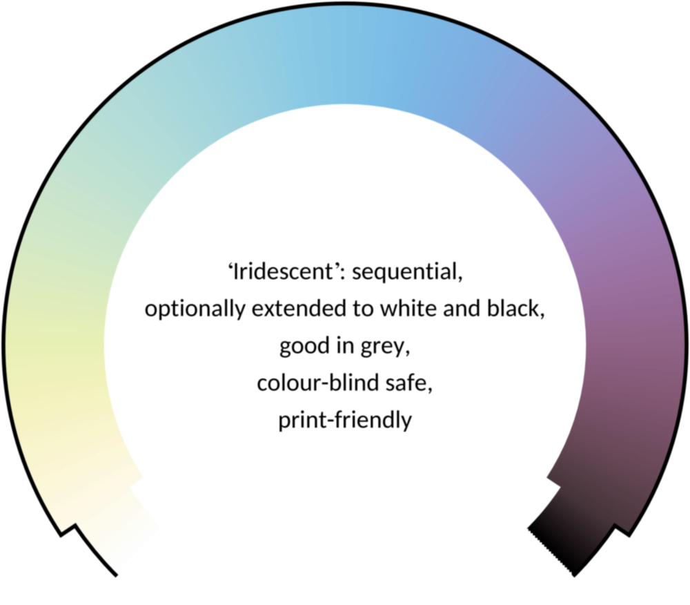
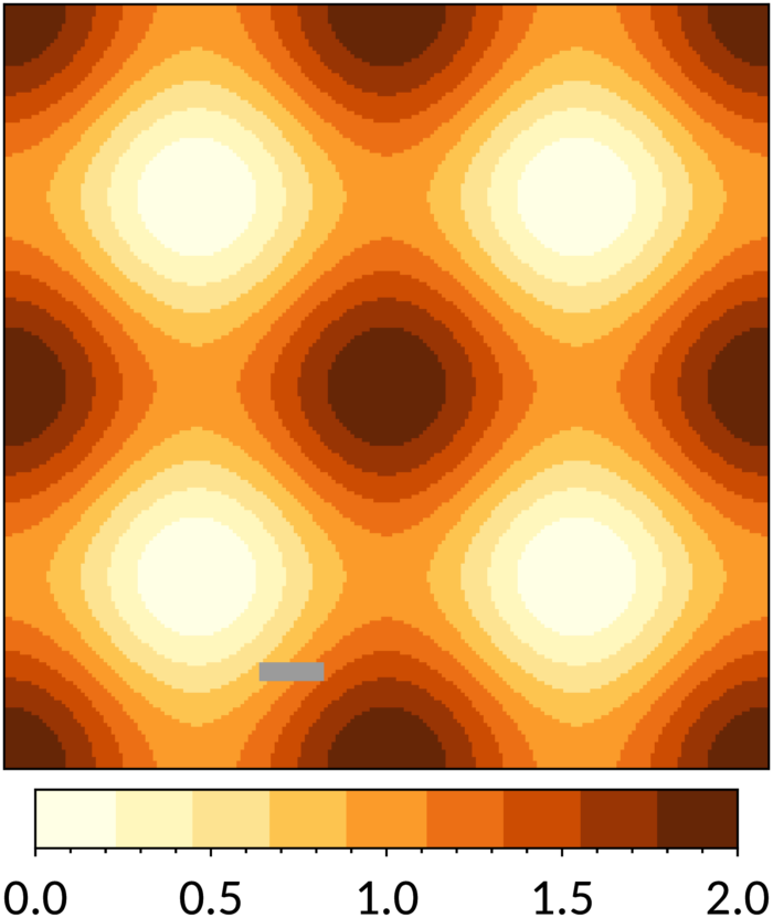
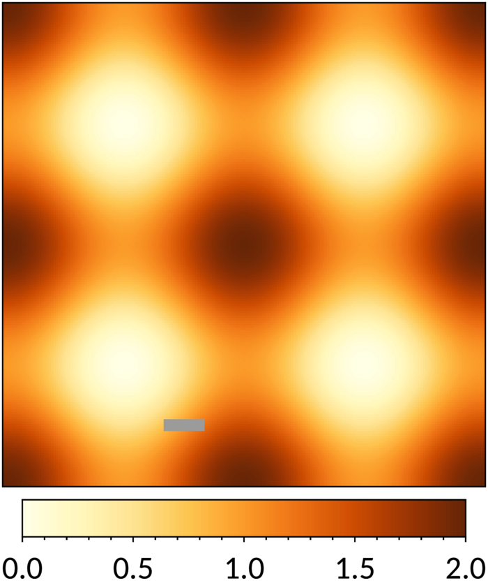
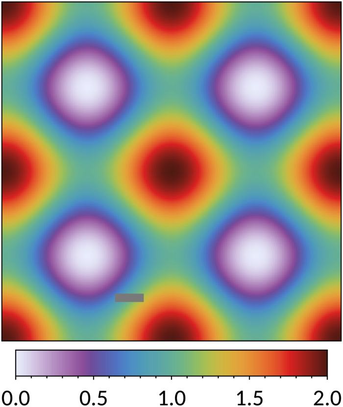
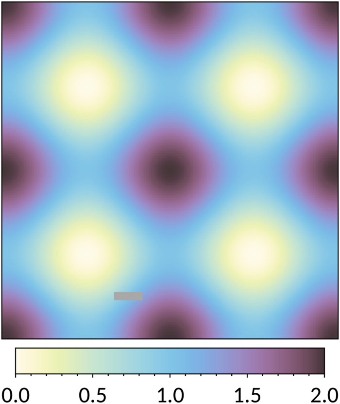
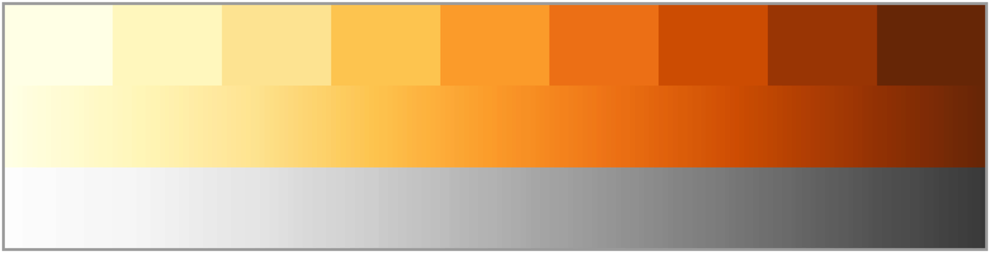
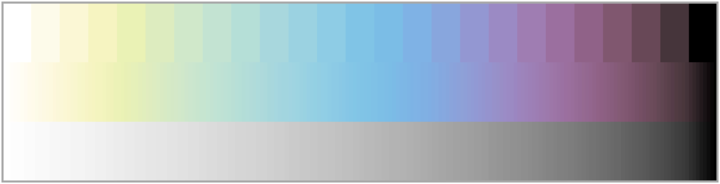
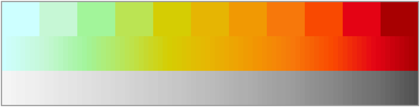
7 July 2026Sequential schemes are for ordered data from low to high. The YlOrBr scheme given in Fig. 19 is a tweaked version of the ColorBrewer YlOrBr scheme. The most distinct grey is also given, useful for data gaps; it is not meant for extreme values. If more colours than shown are needed from this scheme, use a continuous version of the scheme instead of the discrete colours, by linearly interpolating the colour coordinates. If fewer colours are needed, pick colours at equidistant points in the continuous version. An alternative continuous scale is provided by the iridescent scheme, which is the linear interpolation of the colours specified in Fig. 20. The luminance varies linearly, so this scheme also works well for people with monochrome vision and in a monochrome printout. The incandescent scheme in Fig. 21 also has a linearly varying luminance, useful on screen: it has brighter colours, but is not print-friendly, i.e. the colours may shift on paper.
Colours: '#FFFFE5', '#FFF7BC', '#FEE391', '#FEC44F', '#FB9A29', '#EC7014', '#CC4C02', '#993404', '#662506'. Bad data: '#888888'. Colours: '#FEFBE9', '#FCF7D5', '#F5F3C1', '#EAF0B5', '#DDECBF', '#D0E7CA', '#C2E3D2', '#B5DDD8', '#A8D8DC', '#9BD2E1', '#8DCBE4', '#81C4E7', '#7BBCE7', '#7EB2E4', '#88A5DD', '#9398D2', '#9B8AC4', '#9D7DB2', '#9A709E', '#906388', '#805770', '#684957', '#46353A'. Bad data: '#999999'.


Colours: '#CEFFFF', '#C6F7D6', '#A2F49B', '#BBE453', '#D5CE04', '#E7B503', '#F19903', '#F6790B', '#F94902', '#E40515', '#A80003'. Bad data: '#888888'.
There are many warnings that ordered data should not be shown with a rainbow scheme. The arguments are:
- The spectral order of visible light carries no inherent magnitude message. However, a rainbow provides a scheme with many colours, showing subtle effects in the data clearer or making it easier to read the value in a map. There are also cases where a scheme is preferred that does not have pale colours at the low end or middle of the range.
- Most rainbow schemes contain bands of almost constant hue with sharp transitions between them, which are perceived as jumps in the data. This can be avoided with careful design.
- Colour-blind people have difficulty distinguishing some colours of the rainbow. This can be taken into account in the design.


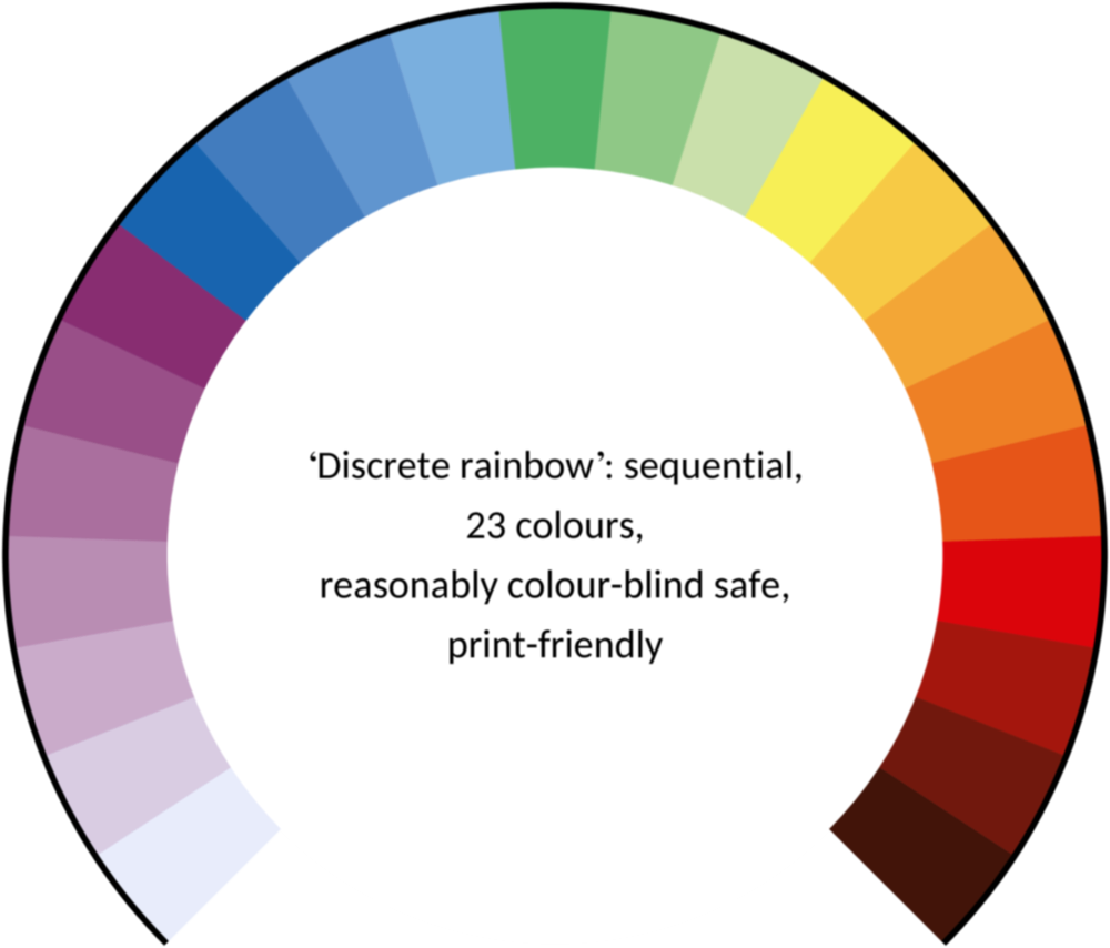
All colours: '#E8ECFB', '#D9CCE3', '#D1BBD7', '#CAACCB', '#BA8DB4', '#AE76A3', '#AA6F9E', '#994F88', '#882E72', '#1965B0', '#437DBF', '#5289C7', '#6195CF', '#7BAFDE', '#4EB265', '#90C987', '#CAE0AB', '#F7F056', '#F7CB45', '#F6C141', '#F4A736', '#F1932D', '#EE8026', '#E8601C', '#E65518', '#DC050C', '#A5170E', '#72190E', '#42150A'. Bad data when 23 colours are used: '#777777'.

Colours: '#E8ECFB', '#DDD8EF', '#D1C1E1', '#C3A8D1', '#B58FC2', '#A778B4', '#9B62A7', '#8C4E99', '#6F4C9B', '#6059A9', '#5568B8', '#4E79C5', '#4D8AC6', '#4E96BC', '#549EB3', '#59A5A9', '#60AB9E', '#69B190', '#77B77D', '#8CBC68', '#A6BE54', '#BEBC48', '#D1B541', '#DDAA3C', '#E49C39', '#E78C35', '#E67932', '#E4632D', '#DF4828', '#DA2222', '#B8221E', '#95211B', '#721E17', '#521A13'. Bad data when off-white is used: '#666666'.
Banded 12 colours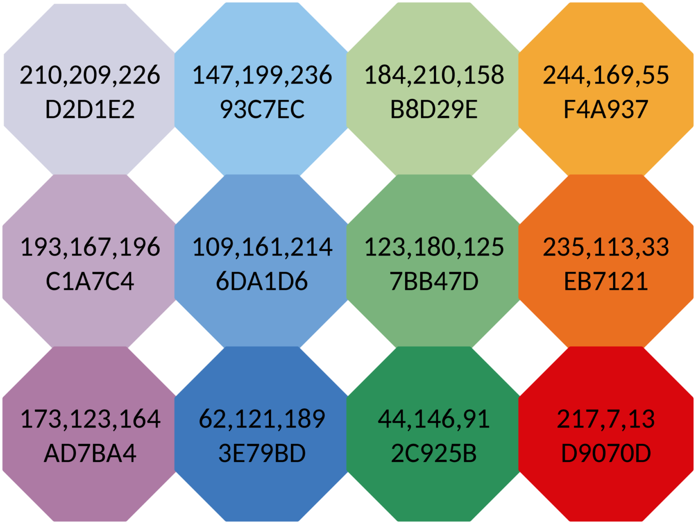 Banded 16 colours
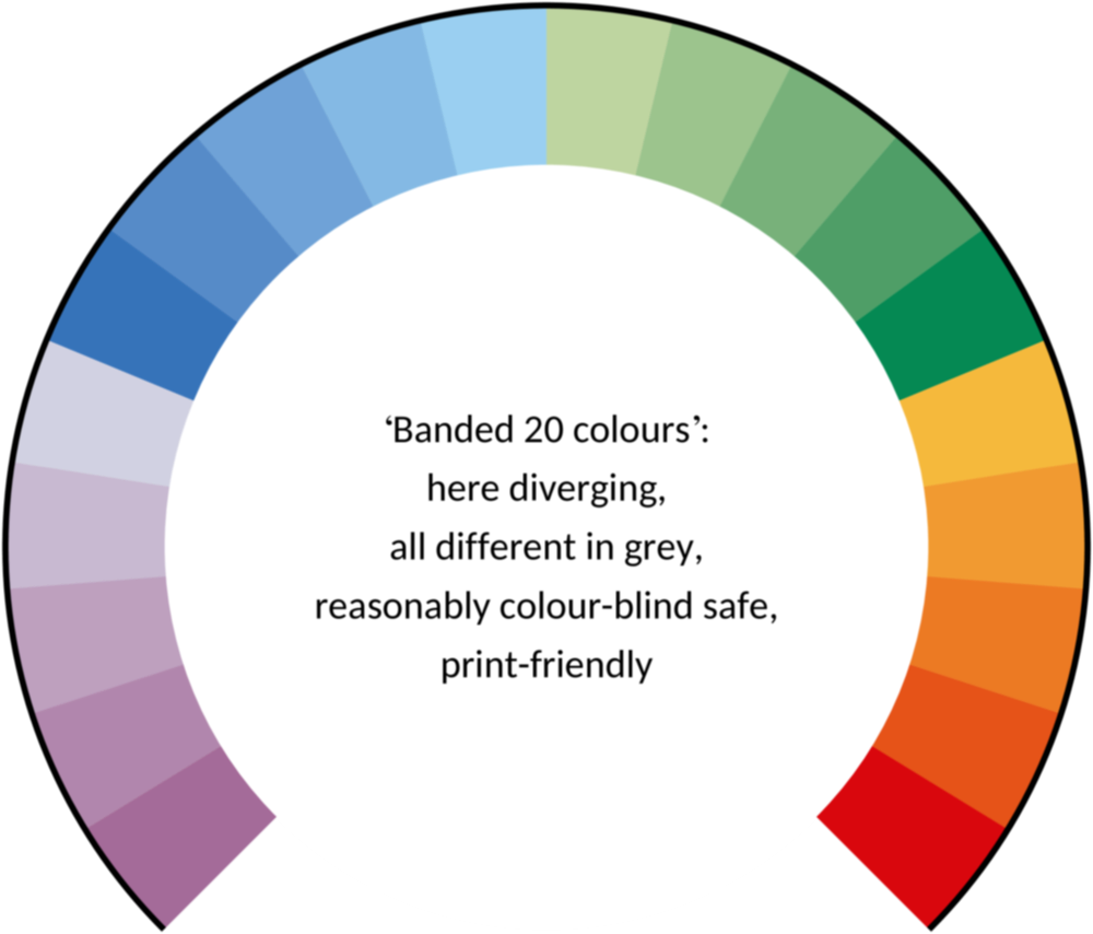
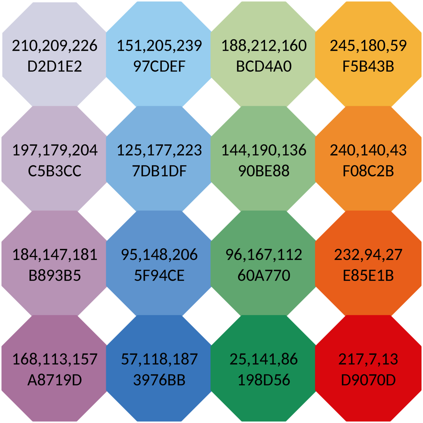 Banded 20 colours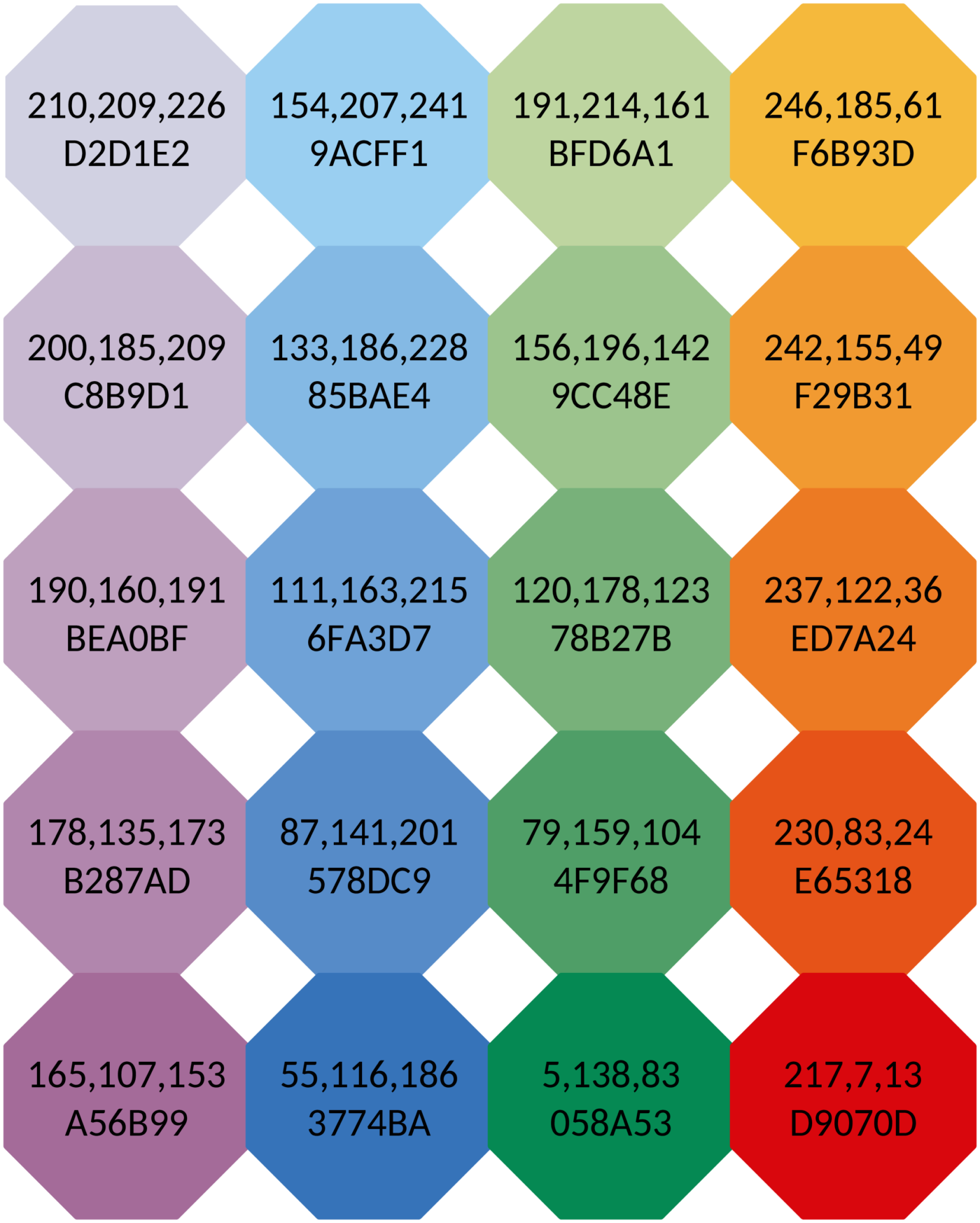
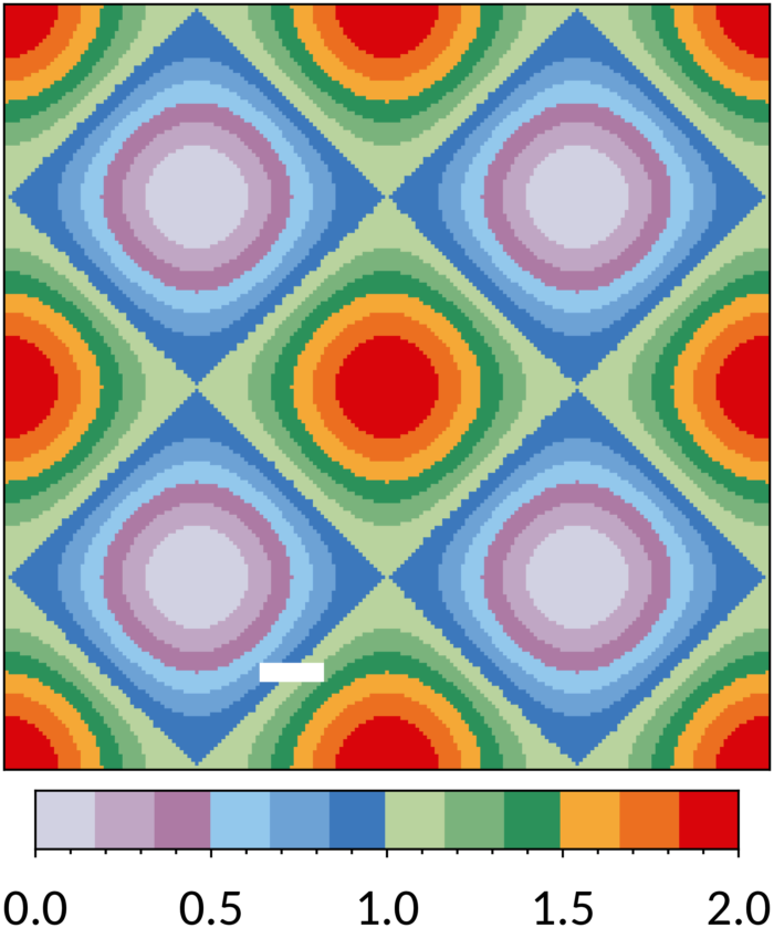
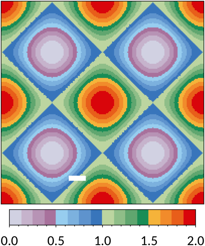
Banded 12 colours: '#D2D1E2', '#C1A7C4', '#AD7BA4', '#93C7EC', '#6DA1D6', '#3E79BD', '#B8D29E', '#7BB47D', '#2C925B', '#F4A937', '#EB7121', '#D9070D'. Banded 16 colours: '#D2D1E2', '#C5B3CC', '#B893B5', '#A8719D', '#97CDEF', '#7DB1DF', '#5F94CE', '#3976BB', '#BCD4A0', '#90BE88', '#60A770', '#198D56', '#F5B43B', '#F08C2B', '#E85E1B', '#D9070D'. Banded 20 colours: '#D2D1E2', '#C8B9D1', '#BEA0BF', '#B287AD', '#A56B99', '#9ACFF1', '#85BAE4', '#6FA3D7', '#578DC9', '#3774BA', '#BFD6A1', '#9CC48E', '#78B27B', '#4F9F68', '#058A53', '#F6B93D', '#F29B31', '#ED7A24', '#E65318', '#D9070D'. Bad data: '#FFFFFF'.



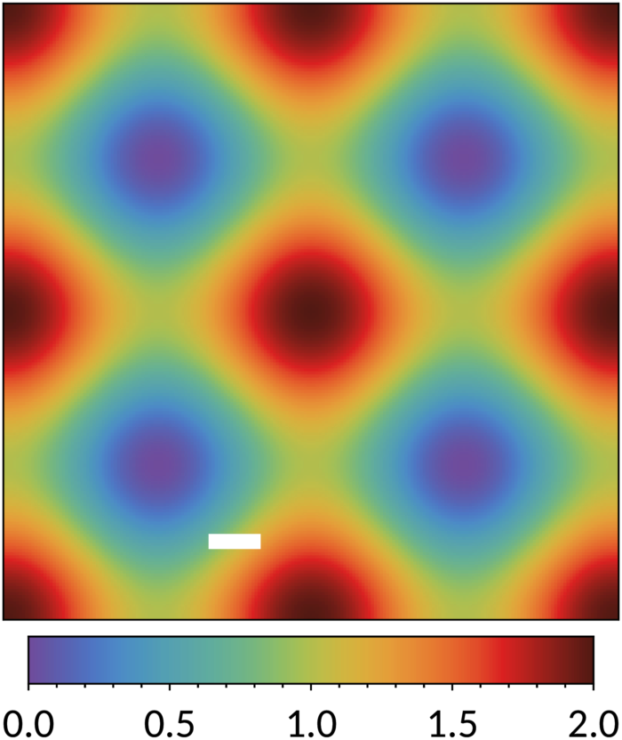
The discrete rainbow colour scheme is inspired by the temperature map of the weather forecast in newspaper de Volkskrant: unconnected curves in CIELAB colour space for purples, blues, greens and oranges, each sampled three times but the last one twice extra for yellow and red, in total 14 colours. The curves were straightened, shifted and sampled equidistantly to make the colours more distinct, reasonably colour-blind safe and print-friendly. Later, the lines were resampled with smaller distances and the scheme was extended towards white and black, to get 23 colours. Figure 25 shows how the two sets can be combined to make a scheme with any number of colours up to 23. If you have an application where one of the colours stands out too much (for example colour 18) or is too close to white or black (colours 1 and 29), use a set with more colours and skip the unwanted colours. Alternatively, consider one of the banded schemes above.






COLOUR BLINDNESS
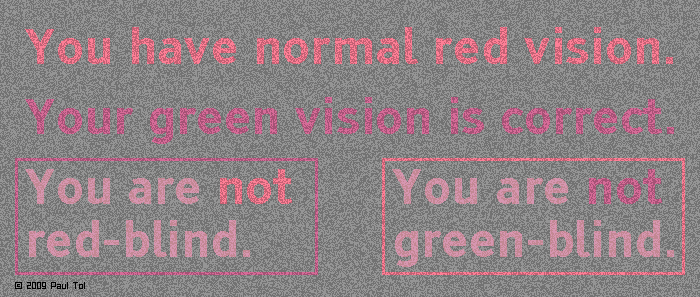
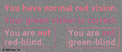
16 August 2026People usually find out at an early age whether they are colour-blind. However, there are subtle variants of colour-vision deficiency. The two main types are:
- Green-blindness – the cone cells in the retina that are sensitive to medium wavelengths are absent or have their response shifted to the red (6 % of men, 0.4 % of women);
- Red-blindness – the cone cells in the retina that are sensitive to long wavelengths are absent or have their response shifted to the green (2.5 % of men).
To simulate green-blindness, all RGB colours in an image are converted to R′G′B′ colours with
R ′ = (4211 + 0.677 G 2.2 + 0.2802 R 2.2)1/2.2,
G ′ = (4211 + 0.677 G 2.2 + 0.2802 R 2.2)1/2.2,
B ′ = (4211 + 0.95724 B 2.2 + 0.02138 G 2.2 − 0.02138 R 2.2)1/2.2,
with parameters R, G and B in the range 0–255 and the output values rounded. To simulate red-blindness, colours are shifted as follows:
R ′ = (782.7 + 0.8806 G 2.2 + 0.1115 R 2.2)1/2.2,
G ′ = (782.7 + 0.8806 G 2.2 + 0.1115 R 2.2)1/2.2,
B ′ = (782.7 + 0.992052 B 2.2 − 0.003974 G 2.2 + 0.003974 R 2.2)1/2.2.
These conversions should be applied in sRGB colour space, i.e. they work on a standard video display, but not necessarily on paper. The conversion can be performed with the free software suite ImageMagick. The following two commands make green-blind and red-blind versions of original image original.png, respectively:
convert original.png \( +clone -channel RG -fx "(0.02138+0.6770*G^2.2+0.2802*R^2.2)^(1/2.2)" \) +swap -channel B -fx "(0.02138(1+v.G^2.2-v.R^2.2)+0.9572*v.B^2.2)^(1/2.2)" greenblind.png
convert original.png \( +clone -channel RG -fx "(0.003974+0.8806*G^2.2+0.1115*R^2.2)^(1/2.2)" \) +swap -channel B -fx "(0.003974(1-v.G^2.2+v.R^2.2)+0.9921*v.B^2.2)^(1/2.2)" redblind.png
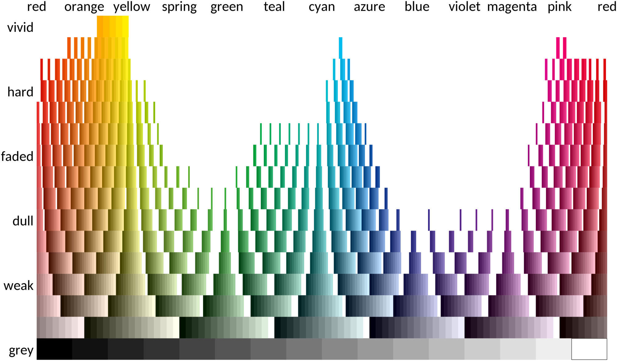
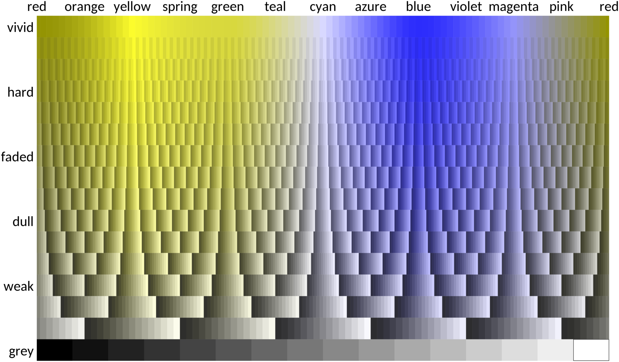
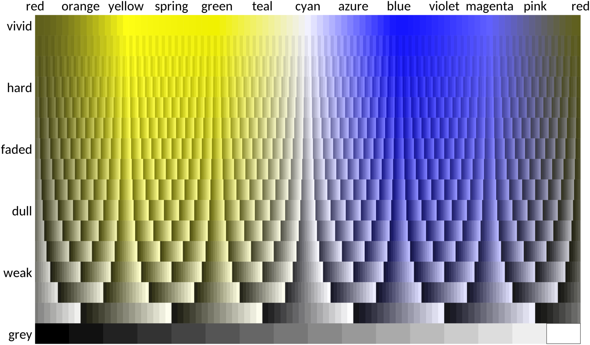
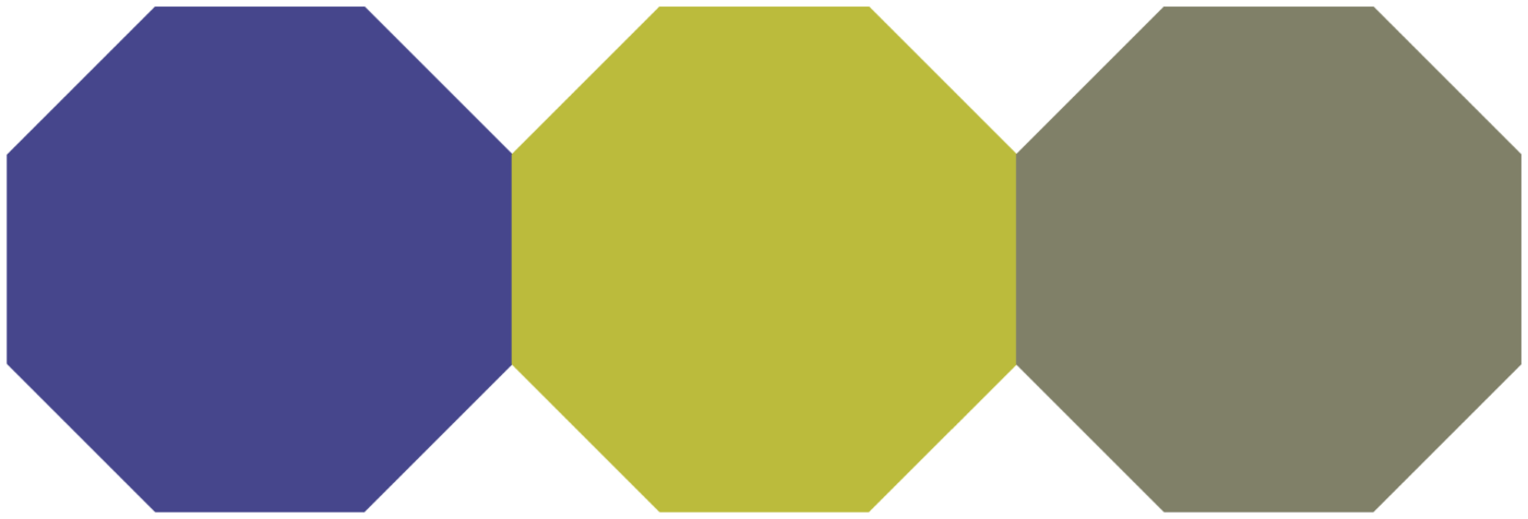
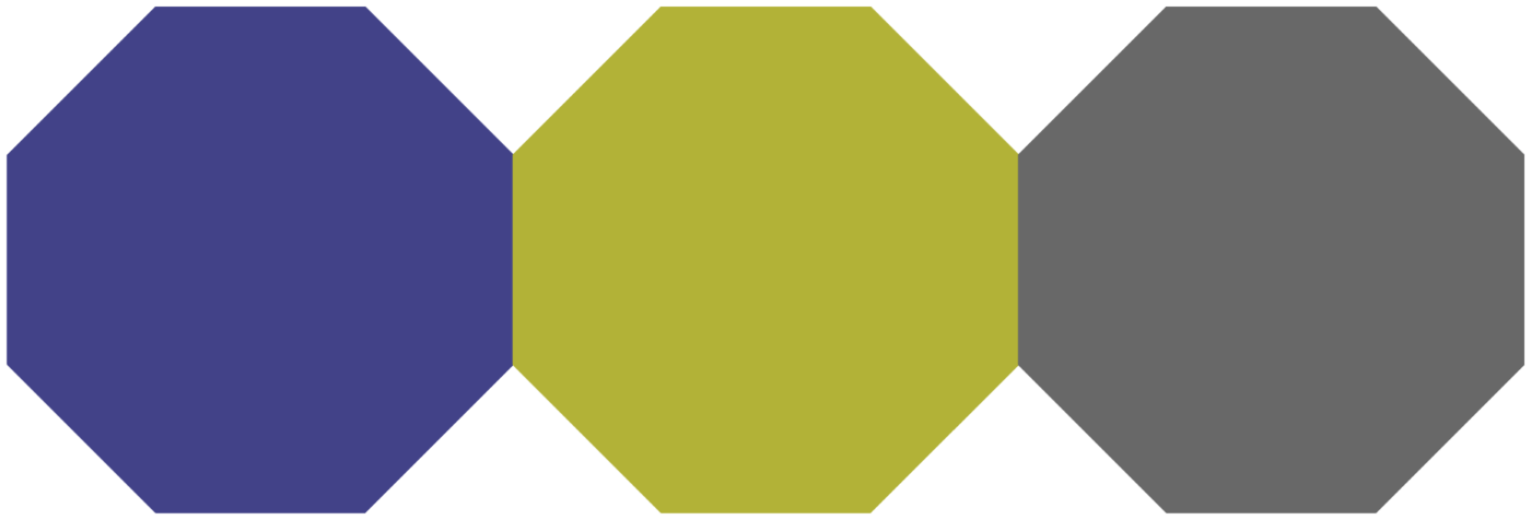
These are Unix-style commands, for Windows replace \( and \) by ( and ). Figure 29 shows the result when the conversions are applied to the grid of websmart colours.
| scheme | normal vision | green-blind vision | red-blind vision |
| bright |  |
 |
 |
| high-contrast |  |
 |
 |
| vibrant |  |
 |
 |
| muted |  |
 |
 |
| medium-contrast |  |
 |
 |
| dark |  |
 |
 |
| light |  |
 |
 |
| sunset |  |
 |
 |
| nightfall |  |
 |
 |
| BuRd |  |
 |
 |
| PRGn |  |
 |
 |
| YlOrBr |  |
 |
 |
| iridescent |  |
 |
 |
| incandescent |  |
 |
 |
| rainbow |  |
 |
 |
| banded 12 |  |
 |
 |
| banded 16 |  |
 |
 |
| banded 20 |  |
 |
 |
GREYSCALE CONVERSION
14 August 2026According to the Web Content Accessibility Guidelines, a contrast ratio between colours of at least 3 is recommended by ISO-9241-3 for standard text and vision, but the Guidelines define a stronger criterion of at least 4.5 to make the colours useful for people with moderately low vision. This includes people with monochrome vision, who only see brightness variations. The criterion actually only applies to body text, but "charts, graphs, diagrams, and other non-text-based information [...] should also have good contrast to ensure that more users can access the information."
If the contrast ratio should be at least 4.5 between a colour and a white background, use the dark scheme (or blue, green or purple from the bright scheme), but if graphics with more than one colour should work after greyscale conversion, the contrast should also be high between the colours. Then even a contrast ratio of 3 cannot be reached using more than one print-friendly websmart colour plus white and black. The only blue shades are 4477BB and 5577AA, almost the same as the blue from the bright scheme. A websmart shade of grey is not available: only 757575 meets the criterion. The largest minimum contrast ratio in a set of two print-friendly websmart colours plus white and black is 2.8 and in a set with three such colours 2.1. One example with three colours is the high-contrast scheme. However, with some precautions it can still be applied to lines and symbols: use the colours in the order
- blue yellow red from the high-contrast scheme
The largest minimum contrast ratio with six colours is 1.5. The medium-contrast scheme uses print-friendly websmart colours not darker than the blue in the high-contrast scheme (from light to dark):
- light yellow light red light blue dark yellow dark red dark blue from the medium-contrast scheme
All other schemes fail the contrast-ratio criterion completely, as they contain too many colours and were designed for standard, red-blind and green-blind vision, relying not only on brightness differences, but also on hue differences. If one of the other qualitative schemes is used, the best subsets for greyscale conversion are (from light to dark):
- yellow red blue from the bright scheme;
- cyan teal red from the vibrant scheme;
- cyan olive purple wine from the muted scheme.
The YlOrBr, iridescent and incandescent sequential schemes work well (Fig. 30). The YlOrBr and iridescent schemes are print-friendly. The iridescent and incandescent schemes were designed to be useful in grey, with a linearly varying luminance. Python's default sequential scheme viridis has a similar property, but it is not print-friendly and seems to have fewer discernible colours. The banded schemes (Fig. 24) have a linearly varying luminance and are print-friendly, but with a smaller range and they should remain discrete. The rainbow schemes do not work. By definition, all diverging schemes do not work either after greyscale conversion.
COLOUR SCHEME FOR GROUND COVER
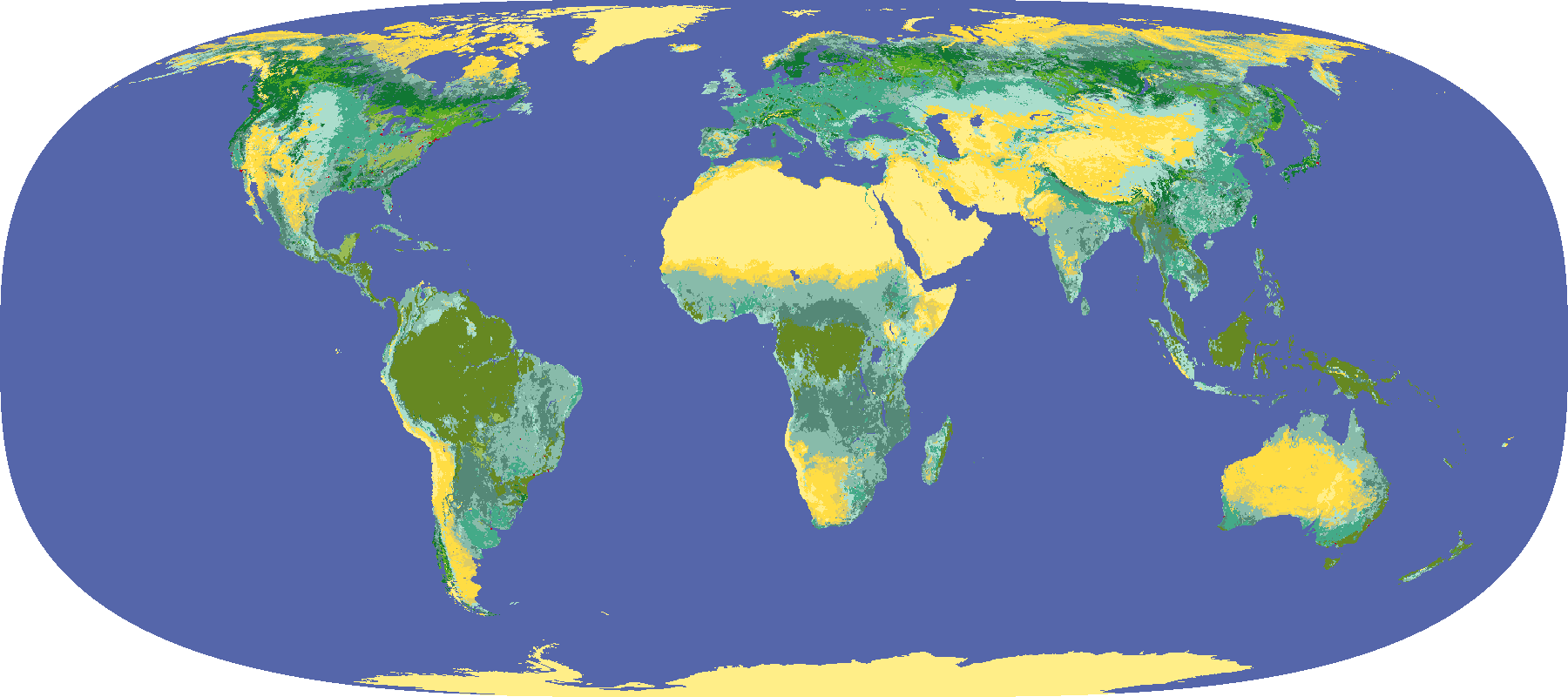
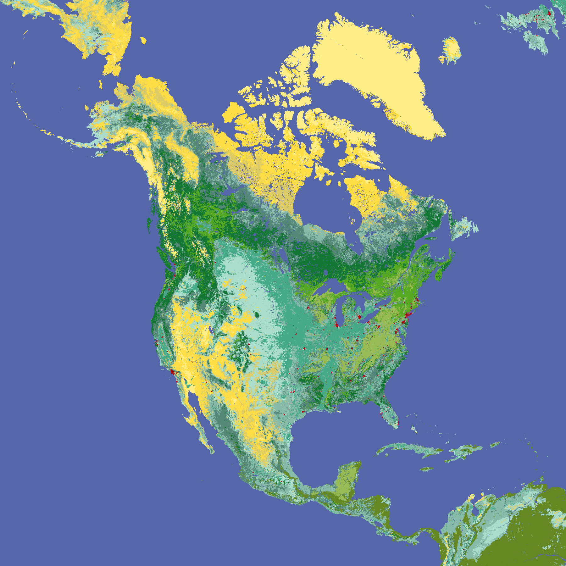
31 May 2018Some data sets need a very specific colour scheme. An example is the global land cover classification, as generated by the University of Maryland Department of Geography from AVHRR data acquired between 1981 and 1994, available at a resolution of 1 km. There is a recommended colour scheme, but the colours are not distinct, some not even in normal vision. Figure 31 gives a more subtle and logical scheme where all colours are distinct in all visions. Figure 32 shows the world with a reduced resolution of 20 km using this scheme. Figure 33 shows only North America at a resolution of 5 km, using almost all classes.
Colours: '#5566AA', '#117733', '#44AA66', '#55AA22', '#668822', '#99BB55', '#558877', '#88BBAA', '#AADDCC', '#44AA88', '#DDCC66', '#FFDD44', '#FFEE88', '#BB0011'.
GOOD AND BAD COLOUR SCHEMES COMPARED
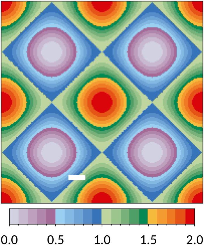
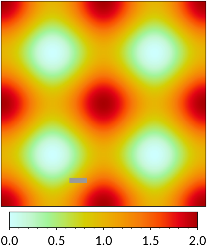
22 November 2009The following figures show the true physical figure of the Earth using two colour schemes: the smooth sunset scheme defined here and a traditional rainbow scheme as defined by many programs (e.g. IDL).
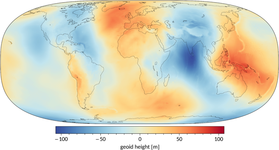
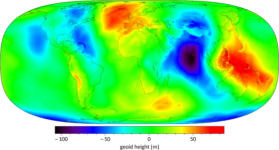
In this context the meaning of the figures is not really important, but if you're interested: they show the distance between the WGS84 ellipsoid and the geoid calculated with the EGM96 gravity model.
WORLD MAPS
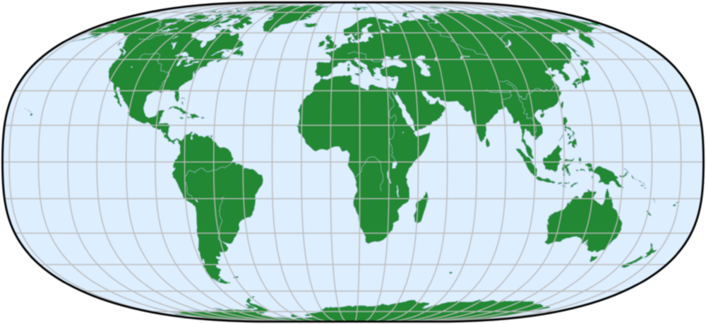
5 September 2026There are many websites on map projections, so I try to keep it brief. A flat map has to make a compromise between distortion of area, (small-feature) shapes and things like scale and direction. If you are not navigating the globe, it is best to use an equal-area (area-preserving) world map. Uninformed news reports suggest that must mean the Equal Earth projection from 2018, but there are many equal-area projections since the 16th century. I will concentrate here on reasonably well-known projections with straight parallels (to see latitude dependencies of data clearly), poles shown as lines instead of points (to avoid crowded polar areas), no splits except an east-west boundary and the smallest average scale and shape errors over the entire world (not just the continents).
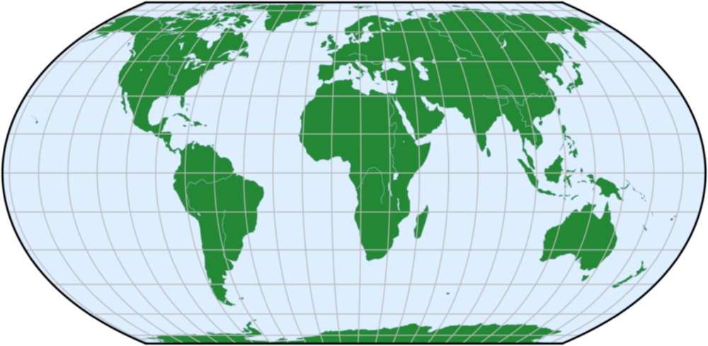
If you want pointed corners, go for Equal Earth. If like me you don't mind a round planet, Eckert IV from 1906 has a bit less distortion. The shape distortion is even smaller if you squeeze the vertical dimension by 10 %, making the aspect ratio 0.45 instead of 0.5. Most noticeable, Africa is then less elongated. If you need the calculation to be simple, use Nell-Hammer (modified by Wagner in 1949: x = (g/2)λ(1+cos φ), y = (2/g)(φ−tan(φ/2)), g = √(2−4/π) with latitude φ, longitude λ), an approximation of Eckert IV. You get extra points if the world is centred around 11.5° E. The east-west boundary is then between Siberia and Alaska instead of through Siberia. In addition, Australia and New Zealand get less distorted and move away from the world edge.
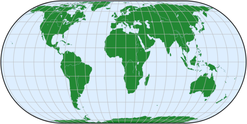
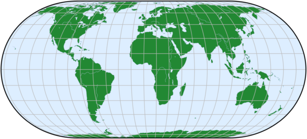
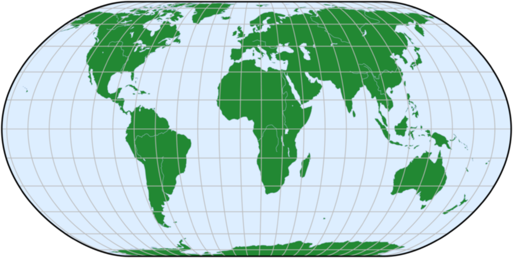
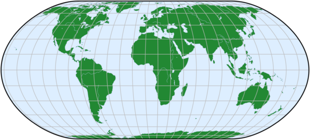
The differences may seem small, but that is due to the selection criteria. Dropping the requirement that the projection should be reasonably well-known, I like a Hufnagel projection with parameters A = 1/18, B = −1/9, ψmax = π/2 and α = 2.2 that I call Hufnagel Z. The equations are: x = 0.2157λ(cos ψ)√(18 + cos 2ψ − 2cos 4ψ), y = 0.3279(sin ψ)√(18 + cos 2ψ − 2cos 4ψ), 72ψ + 40sin 2ψ − sin 4ψ − 2sin 6ψ = 36πsin φ. It has on average less distortion than Eckert IV.
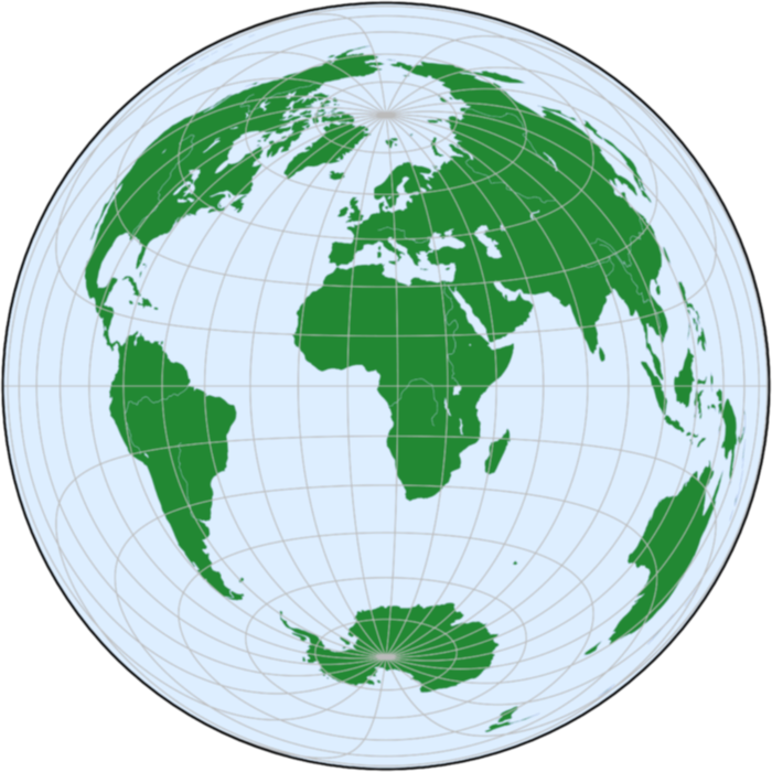
An equal-area projection where the polar areas are shown much better is Lambert Azimuthal Equal-Area from 1772, although it is normally used for regions instead of the whole world. Note that the shape of the central area, in this case Africa, is accurate.
MAP MAKING
31 December 2012Currently I produce maps in two steps. First, I perform the analysis in whatever program and export the data as a particular type of ASCII table. Then, I apply a colour look-up table to the data and export the result as a PNG file. This way, I don't have to redo the analysis if I want a different colour scale, e.g. to emphasize a different value range. The second step is performed on the command line with the command "convert" of ImageMagick, a free, cross-platform and open-source program suite for image manipulation.
The data are exported to a plain portable graymap (PGM) file, which is an ASCII file starting with "P2 w h 65535 ", where w is the width and h the height of the map, followed by a list of integers in the range 0 to (in my case) 65535 with a space or newline between the values. Because the width and height are given, the spaces and newlines can be put wherever you like. The "P2" identifies the file as a PGM file. I scale the data so all values are in the range 0–65532 (but you don't have to fill this whole range). The other possible values are reserved: 65533 for bad data, 65534 for text and lines and 65535 for no data (e.g. outside the projection of the world).
The colour look-up table (clut) is exported to a plain portable pixmap (PPM) file, which is an ASCII file starting with "P3 1 n 255 ", where n is the number of colours, followed by a list of RGB coordinates of the colours as integers in the range 0–255 with a space or newline between the values. I don't use perfectly white, because that may become transparent later on.
Now the image can be produced. The data is stored in input.pgm, the clut in clut.ppm and the image should be output.png. If none of the 3 reserved values are used, then the command is:
convert input.pgm -level 0,65532 clut.ppm -interpolate integer -clut -depth 8 output.png
To spread all available colours over the data range [b,w], change the level option to "-level b,w" (values outside this range will have the first or last colour). To interpolate the colours (for a smooth gradient instead of discrete steps), remove option "-interpolate integer". If any of the reserved values are used, then the command is:
convert input.pgm \( +clone -level 0,65532 clut.ppm -interpolate integer -clut \) \( -clone 0 -black-threshold 65533 -transparent black -fill \#000 -opaque \#FFFEFFFEFFFE -fill \#777 -opaque \#FFFDFFFDFFFD \) -flatten -transparent white -depth 8 output.png
Here I have assumed that text should be black (#000), bad data grey (#777) and areas without data transparent. If you want a white instead of a transparent background, remove option "-transparent white". To treat bad data as background, set it to #FFF. The command above is given in Linux syntax; in Windows, remove all backslashes. If the background is transparent, for clarity a white outline can be added around the objects:
convert output.png -bordercolor none -border 1 \( +clone -channel A -morphology edgeout square +channel +level-colors white \) -compose dstover -composite output_outlined.png
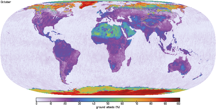
An example: given a map of the albedo at 750 nm including the legend (input.pgm) and a list of colours (clut.ppm), the output of the last two commands above (with "-level 0,9999" and without "-interpolate integer") is this image.
LATEX TEMPLATE FOR REPORTS
20 August 2026General reports, technotes, etc. can be written in LaTeX and pdfLaTeX with two files:
- plain.cls, the class file;
- template_latex.tex, an example and starting point for new documents.
Paul Tol
I am a Dutch instrument scientist with a PhD in atomic physics, working on the TROPOMI, SPEXone and TANGO projects in the Earth programme of SRON. I have normal colour vision, but many colleagues have not. My email address: p.j.j.tol@sron.nl.